mc phone interface and launch

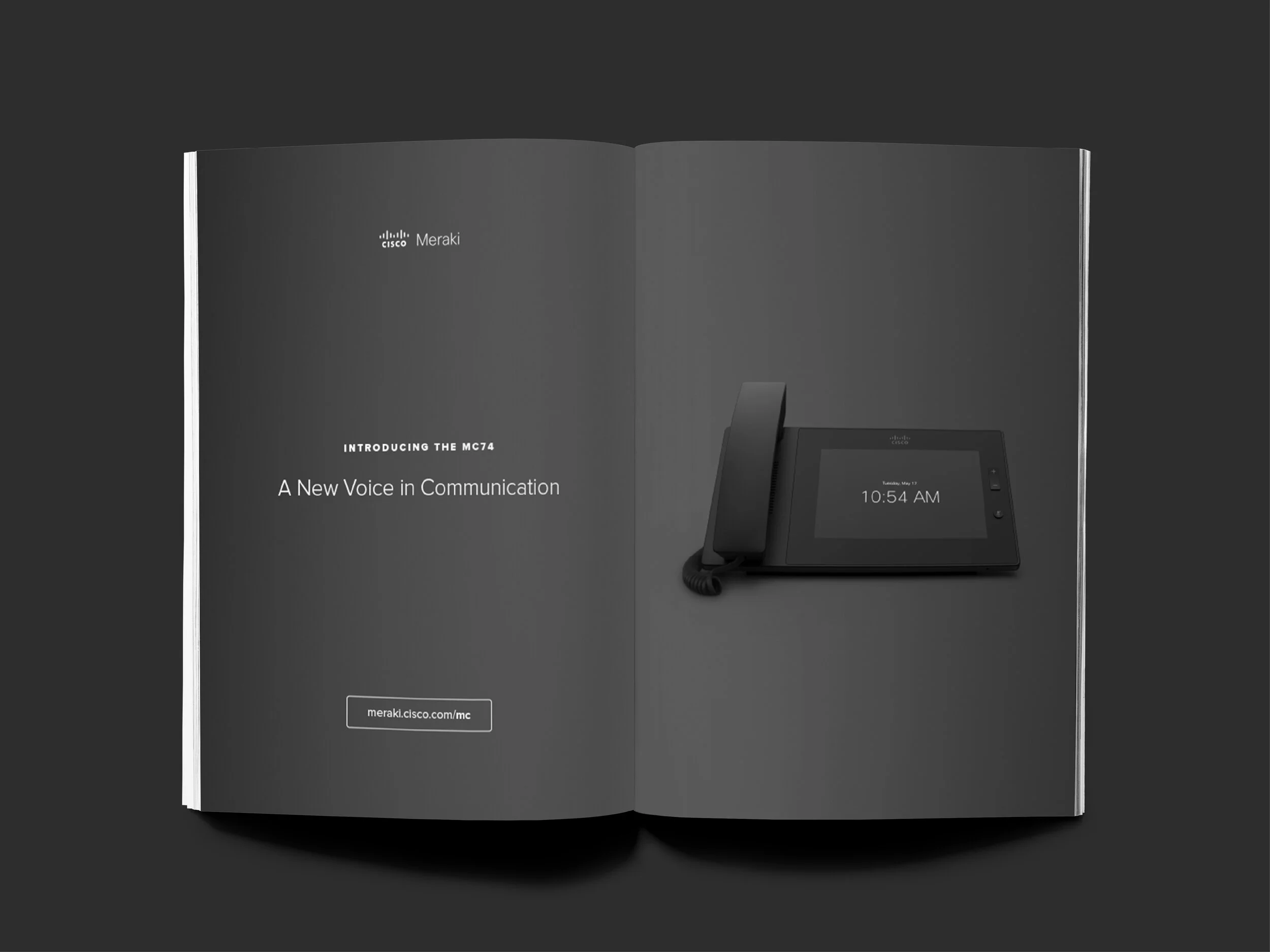
In 2016, Cisco Meraki launched their first cloud-managed phone, the MC74. I worked on the interaction design and visual design along with one other designer. I also designed and coded the product overview page that lives on the Meraki website.
All photographs and renderings included were taken or created by me. In addition, I provided creative direction for accompanying tools, ads, event spaces, and other marketing materials that went along with the launch of this product.

enterprise phone ui
Before focusing on the visual design and details of the user interface, flow diagrams and wireframes were created to understand how the user would navigate throughout the interface. The goal was to create flows that were intuitive and easy for the user. As we moved on to build out the screens and new features that needed visual support, they were added to the larger user flow map.


style guide
For the phone UI, there was a comprehensive style guide created. A specific color palette was selected to ensure the user interface be approachable and friendly while also sleek and elegant. To keep in line with the Meraki brand, the interfaces uses plenty of white space and different shades of grey.
The spec sheets created for the screens as well as details such as button styling and typography guidelines. All of these guidelines were packaged into a google doc for easy access for the entire engineering team, as well as allowing the document to remain living with updates as new features were added and created.

SAMPLE OF SPEC SHEETSThe iconography found throughout the user interface uses simple strokes to appear light and elegant. Each icon was hand drawn and created to help users quickly identify buttons within the interface.
Similar to Meraki's other product interfaces on dashboard, the typeface used is CiscoSans. CiscoSans is modern and clean and the variety of weights help to establish a clear sense of hierarchy.


product overview page and launch materials
For the product landing page, I collaborated with the product marketing and product management teams to drill down on messaging and creative direction. The page gives an overview of the phone's capabilities, technical specifications, user interface, Dashboard features, and other easy-to-use tools.
The layout and content of the page are intended to be concise yet enticing. I incorporated the darker grey to play off the branding of the phone and it's dark packaging. The other color elements came from the phone’s UI, so everything really felt unified.

OVERVIEW LANDING PAGE FOR MC74PRODUCT FEATURES FEATURING CUSTOM ICONOGRAPHY