meraki go fullstack launch
ART DIRECTION, WEB DESIGN, UX/UI
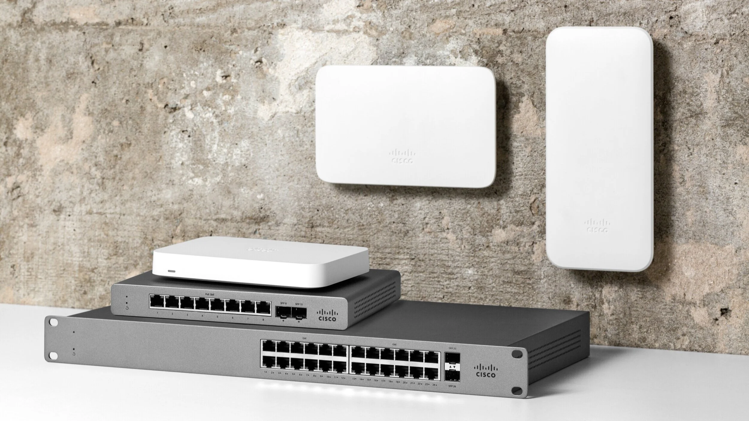
A year after the initial launch of Meraki Go, the line was expanded to create a “full stack”, this includes: access points, switches, and security devices to fully power and protect a small business network.
For this launch, I led design across campaign visuals as well as the newly developed web presence.
creating the story
The original Meraki Go website was executed as an MVP and the launch of the full stack was a great opportunity to revamp the website. Using the brand identity work as a starting off point (see more about that here), I designed the web experience from the ground up by focusing on three distinct areas:
Giving the site a visual facelift to ensure a unified experience across all Meraki Go touch points,
Elevating the user experience, and
Creating personalized user journeys for each of our distinct customer bases.
visual facelift
While the original website was functional (see left image below), it wasn’t exactly visually pleasing or in-line with the brand guidelines. I set out to give the site a visual facelift and focused on three key areas:
Increasing hierarchy, especially with typography to quickly communicate important information at a reader’s first glance,
Using layering as a visual theme to draw the eye down the page naturally, rather than the stripe-y blocks of text in the original web presence, and
Create better impact by utilizing white space in an effective way to have key information stand out more prominently
ORIGINAL MERAKI GO WEBSITE AND REDESIGNED MERAKI GO WEBSITE, SIDE BY SIDE
increase user experience
The user experience of the original Meraki Go web presence left quite a bit to be desired. Several pages were not able to be easily naviaged to, also, the desktop versions were functional, but tablet and mobile left much to be desired. And much of the content on the site operated as strictly informational, rather than engaging web content. The two main focus areas here were:
Creating a purposeful user journey that turns potential customers into leads, and
Optimizing for the mobile experience, as over 50% of our web traffic comes through mobile devices
VISUAL SITE MAP FOR MERAKI GO WEBSITE
WIREFRAMES OF THE PRODUCT PAGE AND THE PERSONA PAGE AT THREE BREAKPOINTS
THE PARTNER SELLER INDEX WHICH I MOVED FROM A CARD LAYOUT INTO A LIST TO OPTIMIZE FOR MOBILE
creating personalized customer journeys
Meraki Go has three main personas: small office (a single-site office of up to 50 people), hospitality (a local, non-chain hospitality business ), and retail (a single-site, non-chain storefront-based business ). Each one of these types of customers has unique opportunities for Meraki Go to fit within their networking story. This type of customer page was an addition to the site and sought to be a landing place for targeted advertisement as well as fill a gap where customers can easily picture how Meraki Go can fit into their lives and businesses.
The design of this page consisted of one template, but is customized through unique content, imagery, and customized icons.
ALL THREE PERSONA LANDING PAGES FOR: SMALL OFFICE, RETAIL, AND HOSPITALITY.
style guide
I crafted a style guide for Meraki Go, which contains the library of common components used in the web presence and expands out to design principles for the design and dev team and to follow for implementation for every piece used in the site, from form elements to typography to banner styling and entire page configurations.
The style guide was vital for both our developers and our designers, giving us a shared kit of parts to work from and ensures consistency within our designs. This is meant to exist as a living document and as more unique pages and interactions are created, they will be documented here.


