meraki go identity
BRANDING, ART DIRECTION, PACKAGING, WEB
Branding and art direction for Meraki Go — a new cloud based networking system managed through an app for small businesses.
As lead designer across every touchpoint, my role was to build a cohesive and compelling visual brand story from scratch — with a friendly, authentic and reliable voice.

logo
Designing a logo for Meraki Go—as a sub-brand of a business unit of Cisco Systems—provided a unique challenge: How to create a visual identity that stands on it’s own in, but still shows where it came from? I led two junior designers on my team to define what Meraki Go stands for visually. The pillars that we worked with were the concepts of “always on” and “connectivity”.
Objectives
Separate Meraki Go from the very large, existing small business networking market, which consists of both enterprise and prosumer solutions
Design an engaging brand around our positioning
Challenges
As Cisco Meraki is a business unit of Cisco Systems, Meraki Go is placed as a sub brand of Cisco Meraki. That is a lot of brand nesting. How do we hint at our origins without becoming “Cisco Meraki - Meraki Go”?
Growing competition in the market, especially in the prosumer space
Finding the delicate balance of being simple, without appearing as a toy and being reliable without appearing boring.

THE FINAL MERAKI GO LOGO LOCKUP

CONSTRUCTION OF THE GLYPH
The glyph shape hints at an infinity symbol and the “rope“ twists much in the same way as an ethernet cable that provides internet connection does.

MERAKI GO GLYPH INITIAL CONCEPTS
A selection of initial concepts that were all based on the key concepts of “always on” and “connectivity”.

typography + color
The color palette is cool-toned and refined with a bright and bold energy. Continuing with the initial concepts of connectivity and always on, gradients and colors that seamlessly work with each other was very important.
The typography is more of a balance between some of the dualities of the Meraki Go brand: reliable, yet approachable and intelligent, yet friendly. Orpheus Pro is used for headings and quotes with Proxima Soft for body copy.


art direction
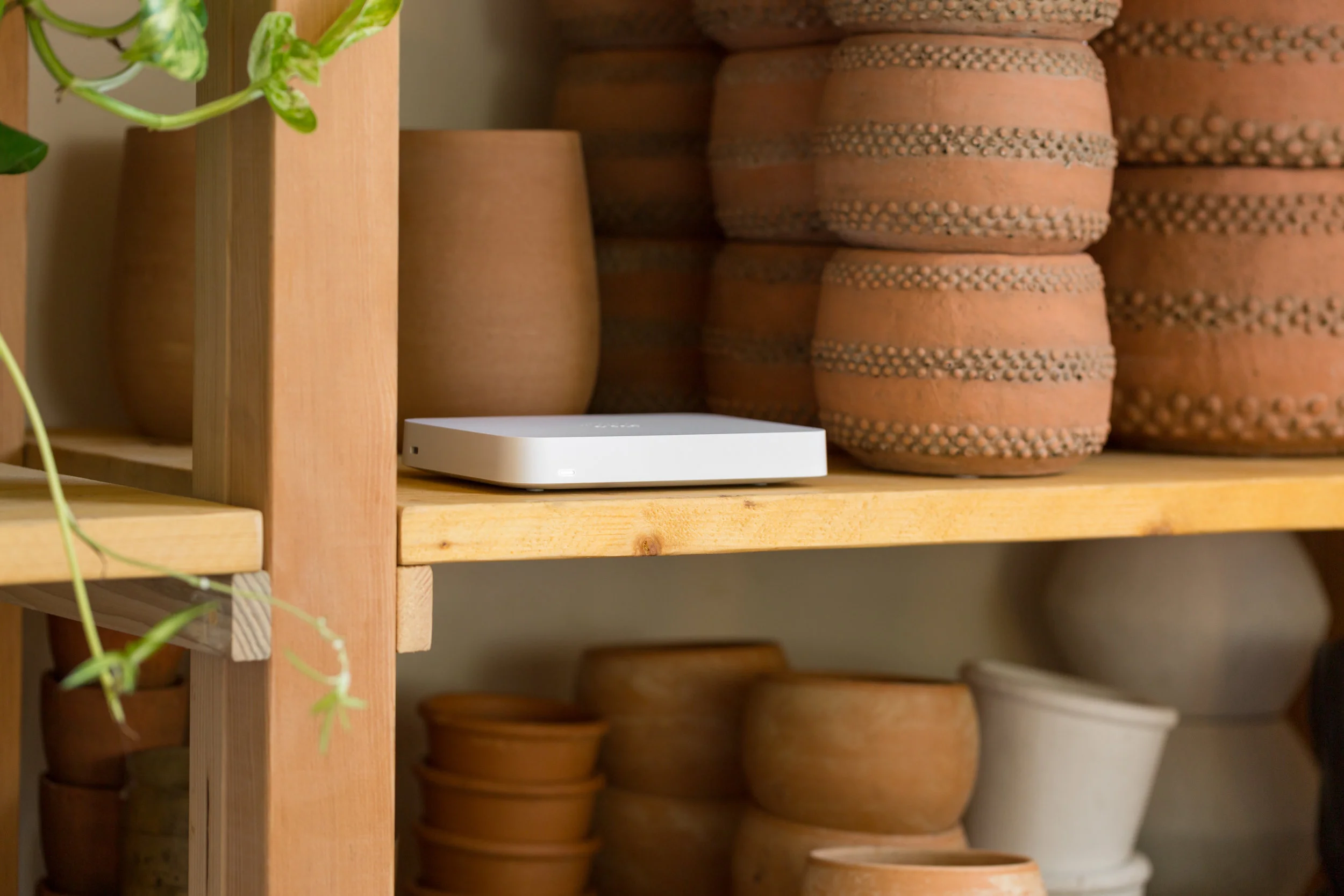
Using a mix of photography and video, the art direction of Meraki Go personifies who our customers are at heart: independent small business owners who love what they do. I cast a diverse group of people, both in ethnicity and age range to capture who Meraki Go customers are.
The feel of the photography style is brightly lit, friendly and real with pops of the brand colors. The style is as if you could step right off the street into any one of these businesses. The products are photographed much in the same way, against natural textures and in-situ.


packaging + guides
Since packaging would be a first impression of the brand, I took this opportunity to review all the major competitor’s boxes, inserts, and presentations. I also did I deep dive into Cisco Meraki’s enterprise packaging to see the opportunities where we could align and where it would be beneficial to differentiate.
The packaging for Meraki Go is an extension of the logo with added texture to add dimension. The outline of the enclosed product is on the top of each of the boxes. Enterprise Cisco Meraki products are all also packaged in kraft paper boxes, but add a fresh feeling to Meraki Go, I selected white ink.
FINAL PACKAGING DESIGN

THE QUICK START GUIDE FOLLOWS THE BRANDING AND ALSO PROVIDES ILLUSTRATIONS TO VISUALLY GUIDE NEW CUSTOMERS
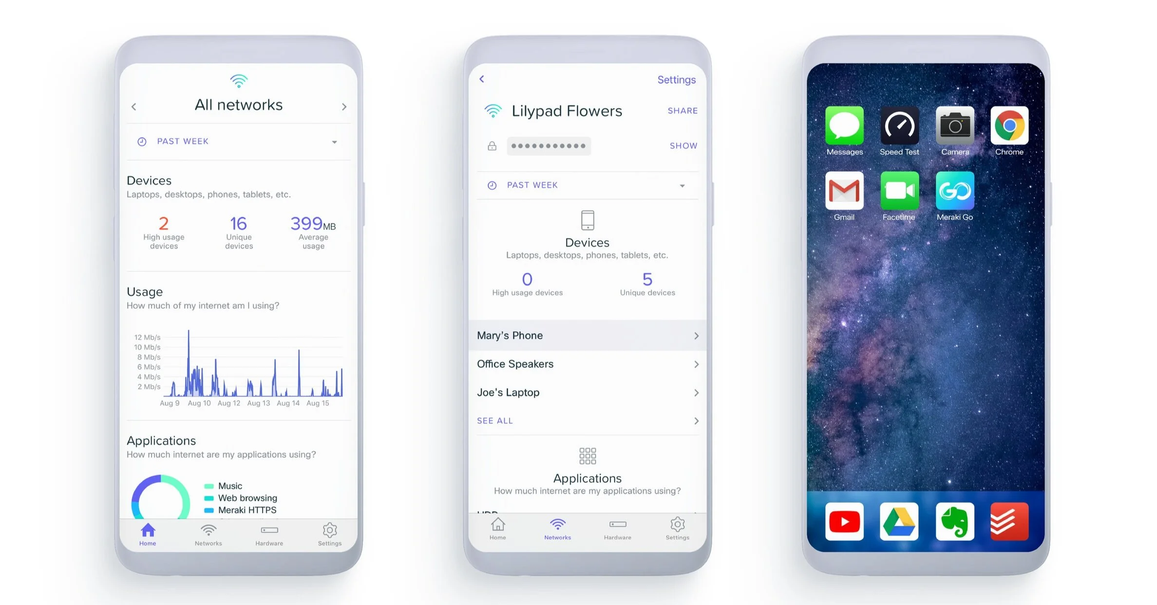
product design
Meraki Go is completely managed through the mobile app for customers to view exactly what is happening in their networks at all times. I worked with a UX designer on our engineering team to make sure that the UI and visual identity was flowed through the mobile app to create a seamless brand experience.